
| Department of Computer Science |
|
| Department of Computer Science |
The human visual system can distinguish hundreds of thousands of different colour shades and intensities, but only around 100 shades of grey. Therefore, in an image, a great deal of extra information may be contained in the colour, and this extra information can then be used to simplify image analysis, e.g. object identification and extraction based on colour.
Three independent quantities are used to describe any particular colour. The hue is determined by the dominant wavelength. Visible colours occur between about 400nm (violet) and 700nm (red) on the electromagnetic spectrum, as shown in figure 1.
 Figure
The saturation is determined by the excitation purity, and depends on the amount of white light mixed with the hue. A pure hue is fully saturated, i.e. no white light mixed in. Hue and saturation together determine the chromaticity for a given colour. Finally, the intensity is determined by the actual amount of light, with more light corresponding to more intense colours[1].
Achromatic light has no colour - its only attribute is quantity or intensity. Greylevel is a measure of intensity. The intensity is determined by the energy, and is therefore a physical quantity. On the other hand, brightness or luminance is determined by the perception of the colour, and is therefore psychological. Given equally intense blue and green, the blue is perceived as much darker than the green. Note also that our perception of intensity is nonlinear, with changes of normalised intensity from 0.1 to 0.11 and from 0.5 to 0.55 being perceived as equal changes in brightness[2].
Colour depends primarily on the reflectance properties of an object. We see those rays that are reflected, while others are absorbed. However, we also must consider the colour of the light source, and the nature of human visual system. For example, an object that reflects both red and green will appear green when there is green but no red light illuminating it, and conversely it will appear red in the absense of green light. In pure white light, it will appear yellow (= red + green).
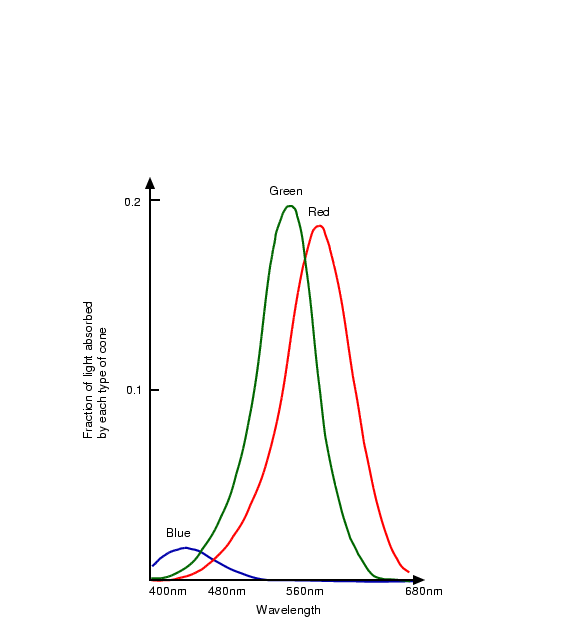
As discussed in lecture 1, the human retina has 3 kinds of cones. The response of each type of cone as a function of the wavelength of the incident light is shown in figure 2. The peaks for each curve are at 440nm (blue), 545nm (green) and 580nm (red). Note that the last two actually peak in the yellow part of the spectrum[2].
 Figure
We have seen how long wavelengths look red and short ones blue, but why is this the case? Is there really anything intrinsically ``red'' about long wavelengths?
The answer is no. Isaac Newton wrote in his 1704 book Opticks[3]
... the Rays to speak properly are not coloured. In them there is nothing else than a certain Power and Disposition to stir up a Sensation of this or that Colour.
In other words, the perception of colour is an entirely arbitrary creation of our nervous system, and is in no way contained in the wavelengths themselves[4].
The tristimulus theory of colour perception seems to imply that any colour can be obtained from a mix of the three primaries, red, green and blue, but although nearly all visible colours can be matched in this way, some cannot. However, if one of the primaries is added to one of these unmatchable colours, it can be matched by a mixture of the other two, and so the colour may be considered to have a negative weighting of that particular primary.
In 1931, the Commission Internationale de l'Éclairage (CIE) defined three standard primaries, called X, Y and Z, that can be added to form all visible colours. The primary Y was chosen so that its colour matching function exactly matches the luminous-efficiency function for the human eye, given by the sum of the three curves in figure 2.
 Figure
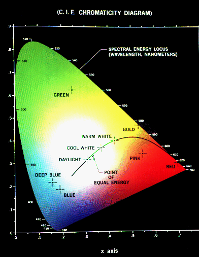
The CIE Chromaticity Diagram (see figure 3) shows all visible colours. The x and y axis give the normalised amounts of the X and Y primaries for a particular colour, and hence z = 1 - x - y gives the amount of the Z primary required. Chromaticity depends on dominant wavelength and saturation, and is independent of luminous energy. Colours with the same chromaticity, but different luminance all map to the same point within this region.
The pure colours of the spectrum lie on the curved part of the boundary, and a standard white light has colour defined to be near (but not at) the point of equal energy x = y = z = 1/3. Complementary colours, i.e. colours that add to give white, lie on the endpoints of a line through this point. As illustrated in figure 4, all the colours along any line in the chromaticity diagram may be obtained by mixing the colours on the end points of the line. Furthermore, all colours within a triangle may be formed by mixing the colours at the vertices. This property illustrates graphically the fact that all visible colours cannot be obtained by a mix of R, G and B (or any other three visible) primaries alone, since the diagram is not triangular!
 Figure
Colour models provide a standard way to specify a particular colour, by defining a 3D coordinate system, and a subspace that contains all constructible colours within a particular model. Any colour that can be specified using a model will correspond to a single point within the subspace it defines. Each colour model is oriented towards either specific hardware (RGB,CMY,YIQ), or image processing applications (HSI).
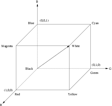
In the RGB model, an image consists of three independent image planes, one in each of the primary colours: red, green and blue. (The standard wavelengths for the three primaries are as shown in figure 1). Specifying a particular colour is by specifying the amount of each of the primary components present. Figure 5 shows the geometry of the RGB colour model for specifying colours using a Cartesian coordinate system. The greyscale spectrum, i.e. those colours made from equal amounts of each primary, lies on the line joining the black and white vertices.
 Figure
This is an additive model, i.e. the colours present in the light add to form new colours, and is appropriate for the mixing of coloured light for example. The image on the left of figure 6 shows the additive mixing of red, green and blue primaries to form the three secondary colours yellow (red + green), cyan (blue + green) and magenta (red + blue), and white ((red + green + blue).
The RGB model is used for colour monitors and most video cameras.
The CMY (cyan-magenta-yellow) model is a subtractive model appropriate to absorption of colours, for example due to pigments in paints. Whereas the RGB model asks what is added to black to get a particular colour, the CMY model asks what is subtracted from white. In this case, the primaries are cyan, magenta and yellow, with red, green and blue as secondary colours (see the image on the right of figure 6).
When a surface coated with cyan pigment is illuminated by white light, no red light is reflected, and similarly for magenta and green, and yellow and blue. The relationship between the RGB and CMY models is given by:
| ||||||||||||||||||||||||||||
The CMY model is used by printing devices and filters.
 Figure
As all schoolchildren know, the way to make green paint is to mix blue paint with yellow. But how does this work? If blue paint absorbs all but blue light, and yellow absorbs blue only, when combined no light should be reflected and black paint result.
However, what actually happens is that imperfections in the paint are exploited. In practice, blue paint reflects not only blue, but also some green. Since the yellow paint also reflects green (since yellow = green + red), some green is reflected by both pigments, and all other colours are abosrbed, resulting in green paint.
As mentioned above, colour may be specified by the three quantities hue, saturation and intensity. This is the HSI model, and the entire space of colours that may be specified in this way is shown in figure 7.
 Figure
Conversion between the RGB model and the HSI model is quite complicated. The intensity is given by
|
|
The YIQ (luminance-inphase-quadrature) model is a recoding of RGB for colour television, and is a very important model for colour image processing. The importance of luminance was discussed in § 1.
The conversion from RGB to YIQ is given by:
| ||||||||||||||||||||||||||||||||||||||||
The Y component is the same as the CIE primary Y (see § 2.1).
 Figure
Given all these different representations of colour, and hence colour images, the question arises as to what is the best way to apply the image processing techniques we have covered so far to these images? One possibility is to apply the transformations to each colour plane in an RGB image, but what exactly does this mean? If we want to increase the contrast in a dark image by histogram equalisation, can we just equalise each colour independently? This will result in quite different colours in our transformed image. In general it is better to apply the transformation to just the intensity component of an HSI image, or the luminance component of a YIQ image, thus leaving the chromaticity unaltered.
An example is shown in figure 9. When histogram equalisation is applied to each colour plane of the RGB image, the final image is lighter, but also quite differently coloured to the original. When histogram equalisation is only applied to the luminance component of the image in YIQ format, the result is more like a lighter version of the original image, as required.
 Figure