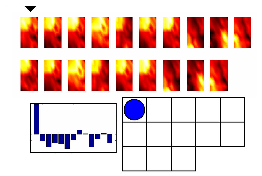
 The animated gif above shows the output of the second layer map for
the same 19 units shown in the previous example. The units are
represented by their first layer activations. The outputs shown are a
bar chart of the activations, plus a counter showing which node of the
13-node net shown previously is most highly activated by the unit.
The animated gif above shows the output of the second layer map for
the same 19 units shown in the previous example. The units are
represented by their first layer activations. The outputs shown are a
bar chart of the activations, plus a counter showing which node of the
13-node net shown previously is most highly activated by the unit.
The same structure is seen as before, but now there is an unambiguous
labelling provided for each unit.