 Graphing
Data
Graphing
Data
Line Sources
 Discharge sources emit large amounts of irradiance at particular atomic
spectral lines, in addition to a constant, thermal based continuum.
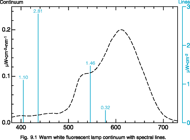
The most accurate way to portray both of these aspects on the same graph
is with a dual axis plot, shown in figure 9.1. The spectral lines
are graphed on an irradiance axis (W/cm2) and the continuum
is graphed on a band irradiance (W/cm2/nm) axis. The spectral
lines ride on top of the continuum.
Discharge sources emit large amounts of irradiance at particular atomic
spectral lines, in addition to a constant, thermal based continuum.
The most accurate way to portray both of these aspects on the same graph
is with a dual axis plot, shown in figure 9.1. The spectral lines
are graphed on an irradiance axis (W/cm2) and the continuum
is graphed on a band irradiance (W/cm2/nm) axis. The spectral
lines ride on top of the continuum.
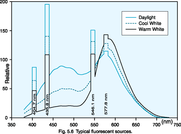
Another useful way to graph mixed sources is to plot spectral lines
as a rectangle the width of the monochromator bandwidth. (see fig.
5.6) This provides a good visual indication of the relative amount
of power contributed by the spectral lines in relation to the continuum,
with the power being bandwidth times magnitude.
Polar Spatial Plots
The best way to represent the responsivity of a detector with respect to
incident angle of light is by graphing it in Polar Coordinates. The
polar plot in figure 9.2 shows three curves: A power response (such as
a laser beam underfilling a detector), a cosine response (irradiance overfilling
a detector), and a high gain response (the effect of using a telescopic
lens). This method of graphing is desirable, because it is easy to
understand visually. Angles are portrayed as angles, and responsivity
is portrayed radially in linear graduations.
The power response curve clearly shows that the response between -60
and +60 degrees is uniform at 100 percent. This would be desirable
if you were measuring a laser or focused beam of light, and underfilling
a detector. The uniform response means that the detector will ignore
angular misalignment.
The cosine response is shown as a circle on the graph. An irradiance
detector with a cosine spatial response will read 100 percent at 0 degrees
(straight on), 70.7 percent at 45 degrees, and 50 percent at 60 degrees
incident angle. (Note that the cosines of 0°, 45° and 60°,
are 1.0, 0.707, and 0.5, respectively).
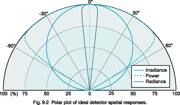 The radiance response curve has a restricted field of view of ±
5°. Many radiance barrels restrict the field of view even further
(± 1-2° is common). High gain lenses restrict the field
of view in a similar fashion, providing additional gain at the expense
of lost off angle measurement capability.
The radiance response curve has a restricted field of view of ±
5°. Many radiance barrels restrict the field of view even further
(± 1-2° is common). High gain lenses restrict the field
of view in a similar fashion, providing additional gain at the expense
of lost off angle measurement capability.
Cartesian Spatial Plots
The cartesian graph in figure 9.3 contains the same data as the polar plot
in figure 9.2 on the previous. The power and high gain curves are
fairly easy to interpret, but the cosine curve is more difficult to visually
recognize. Many companies give their detector spatial responses in
this format, because it masks errors in the cosine correction of the diffuser
optics. In a polar plot the error is easier to recognize, since the
ideal cosine response is a perfect circle.
In full immersion applications such as phototherapy, where light is
coming from all directions, a cosine spatial response is very important.
The skin (as well as most diffuse, planar surfaces) has a cosine response.
If a cosine response is important to your application, request spatial
response data in polar format.
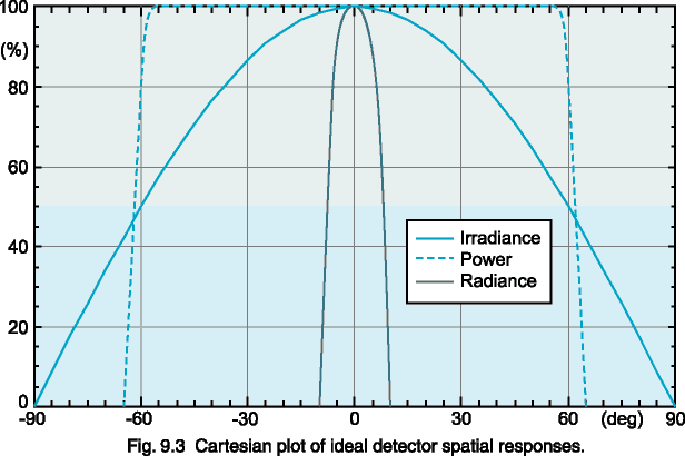 At the very least, the true cosine response should be superimposed over
the Cartesian plot of spatial response to provide some measure of comparison.
At the very least, the true cosine response should be superimposed over
the Cartesian plot of spatial response to provide some measure of comparison.
Note: Most graphing software packages do not provide for the creation
of polar axes. Microsoft Excel, for example, does have radar category
charts, but does not support polar scatter plots yet. SigmaPlot,
an excellent scientific graphing package, supports polar plots, as well
as custom axes such as log-log etc. Their web site is: http://www.spss.com/software/science/sigmaplot/
Logarithmically Scaled Plots
A log plot portrays each 10 to 1 change as a fixed linear displacement.
Logarithmically scaled plots are extremely useful at showing two important
aspects of a data set. First, the log plot expands the resolution
of the data at the lower end of the scale to portray data that would be
difficult to see on a linear plot. The log scale never reaches zero,
so data points that are 1 millionth of the peak still receive equal treatment.
On a linear plot, points near zero simply disappear.
The second advantage of the log plot is that percentage difference is
represented by the same linear displacement everywhere on the graph.
On a linear plot, 0.09 is much closer to 0.10 than 9 is to 10, although
both sets of numbers differ by exactly 10 percent. On a log plot,
0.09 and 0.10 are the same distance apart as 9 and 10, 900 and 1000, and
even 90 billion and 100 billion. This makes it much easier to determine
a spectral match on a log plot than a linear plot.
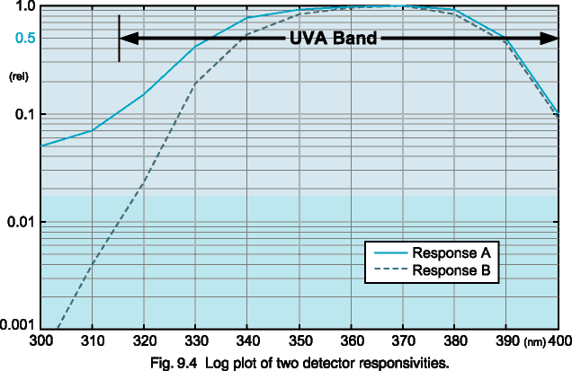 As you can clearly see in figure 9.4, response B is within 10 percent of
response A between 350 and 400 nm. Below 350 nm, however, they clearly
mismatch. In fact, at 315 nm, response B is 10 times higher than
response A. This mismatch is not evident in the linear plot, figure
9.5, which is plotted with the same data.
As you can clearly see in figure 9.4, response B is within 10 percent of
response A between 350 and 400 nm. Below 350 nm, however, they clearly
mismatch. In fact, at 315 nm, response B is 10 times higher than
response A. This mismatch is not evident in the linear plot, figure
9.5, which is plotted with the same data.
One drawback of the log plot is that it compresses the data at the top
end, giving the appearance that the bandwidth is wider than it actually
is. Note that Figure 9.4 appears to approximate the UVA band.
Linearly Scaled Plots
Most people are familiar with graphs that utilize linearly scaled axes.
This type of graph is excellent at showing bandwidth, which is usually
judged at the 50 percent power points. In figure 9.5, it is easy
to see that response A has a bandwidth of about 58 nm (332 to 390 nm).
It is readily apparent from this graph that neither response A nor response
B would adequately cover the entire UVA band (315 to 400 nm), based on
the location of the 50 percent power points. In the log plot of the
same data (fig. 9.4), both curves appear to fit nicely within the UVA band.
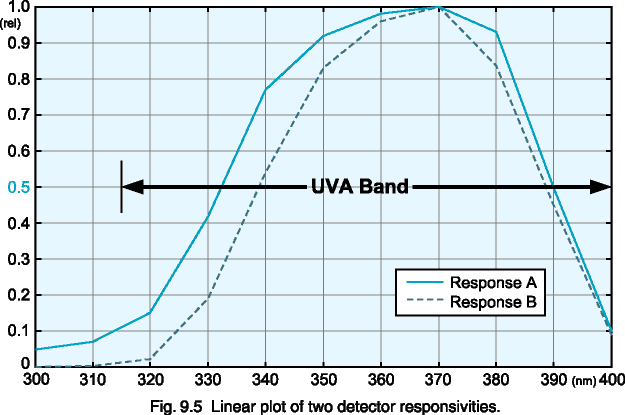 This type of graph is poor at showing the effectiveness of a spectral match
across an entire function. The two responses in the linear plot appear
to match fairly well. Many companies, in an attempt to portray their
products favorably, graph detector responses on a linear plot in order
to make it seem as if their detector matches a particular photo-biological
action spectrum, such as the Erythemal or Actinic functions. As you
can clearly see in the logarithmic curve (fig. 9.4), response A matches
response B fairly well above 350 nm, but is a gross mismatch below that.
Both graphs were created from the same set of data, but convey a much different
impression.
This type of graph is poor at showing the effectiveness of a spectral match
across an entire function. The two responses in the linear plot appear
to match fairly well. Many companies, in an attempt to portray their
products favorably, graph detector responses on a linear plot in order
to make it seem as if their detector matches a particular photo-biological
action spectrum, such as the Erythemal or Actinic functions. As you
can clearly see in the logarithmic curve (fig. 9.4), response A matches
response B fairly well above 350 nm, but is a gross mismatch below that.
Both graphs were created from the same set of data, but convey a much different
impression.
As a rule of thumb - half power bandwidth comparisons and peak spectral
response should be presented on a linear plot. Spectral matching
should be evaluated on a log plot.
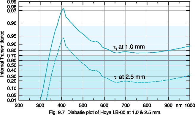
Linear vs. Diabatie Spectral Transmission Curves
The Diabatie scale (see fig. 9.7) is a log-log scale used by filter glass
manufacturers to show internal transmission for any thickness. The
Diabatie value, q(l), is defined as follows
according to DIN 1349:
q(l)
= 1 - log(log(1/t))
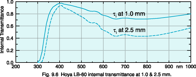
Linear transmission curves are only useful for a single thickness (fig.
9.6). Diabatie curves retain the same shape for every filter glass
thickness, permitting the use of a transparent sliding scale axis overlay,
usually provided by the glass manufacturer. You merely line up the
key on the desired thickness and the transmission curve is valid.

 HOME
Copyright © 1997
International Light, Inc.
Alex
Ryer 26.September.1997
HOME
Copyright © 1997
International Light, Inc.
Alex
Ryer 26.September.1997